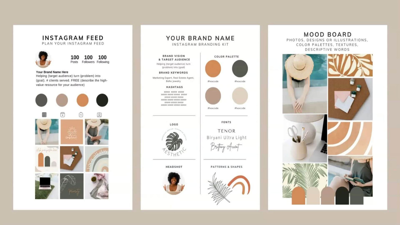
Instagram is a great tool for marketing. But lots of things come down to the effect that the account creates: the overall vibe, the colors, and the composition of the images. We’ve put together some recommendations to help make a beautiful feed and develop a special brand aesthetic. A unified style is those details that unify the entire visual. For example, it could be the style of the photos – dark deep, airy light photos or the attributes of the frame – rustic, vintage, kinfolk, and others. Even some common character or subject matter. But in search of your own style, you don’t have to force yourself into rigid frames and be locked in one direction. It is possible to combine completely different photos if you follow a few rules.
Choose the mood of the account

The profile doesn’t influence business sales on its own, although the Instagram following is very important. In order for customers to turn into sales leads, they need to be inspired. Try to understand which feelings you need to arouse in your subscribers. The type of your page and your selection of images will affect that. So if you’re trading homeware, a hygge style will work: lights and comfy plaids in your photos, warm colors, and gentle nuances in your images. And for luxury skins, you should consider photographing darker, brighter tones; if the focus is right, these pictures will be full of ambiance.
From darker to lighter shots

Dark and bright, hot and cool photos can be mixed together on the same account – design your Instagram account so that you can make shifts with ease. For the sake of example, if you got a few bright photos and then want to post a dark picture, upload a bright image with some dark undertones in front of it. Then, it will look as if some shades blend into others. This kind of “gradient” appears nice in your strip and helps to blend your clients’ pictures into it.
Put colored accents

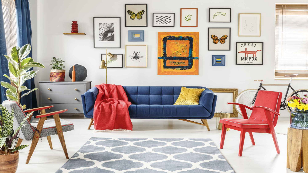
The color gives pictures a twist and motivates us to come up and look at the specifics. This is because our gaze selects vivid splashes of color, particularly while viewing pictures from a camera. So for accоunts in navy shades – like gray or creamy – it’s advised to include vivid elements so the ribbon doesn’t appear boring. But in case your frames are bright, you’d rather create quiet items – that means no extra mottling while watching the ribbon.
Alternate general and close-ups
Your content appears more balanced if your pictures are published next to each other. For this reason, if you run an e-store with clothes, you might start with a full-length picture of a woman in a dress, then a half-length image, followed by a close-up photo of the underside of the dress or a pretty clasp. That way, it won’t seem like you’re copying yourself. The rotation of the angles makes the ribbon look different and alive.
The characters in the pictures are changing, the surroundings are also changing – then the feed looks full of events. To plan your Instagram content in advance, use special apps. With their help, it’s easy to upload photos, combine them, and choose the perfect sequence.
